020EDITORIAL · EDITORIAL LAYOUT SYSTEM
Elegant Living – Luxury Lifestyle Editorial Design
A calm, image-led magazine system built around slow living and understated luxury.
OVERVIEW
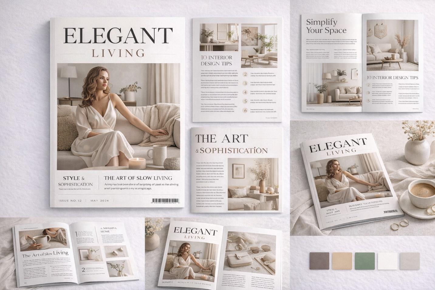
A lifestyle brand centered on slow living and interior design needed a magazine layout that reinforced its premium positioning. The project delivered a full editorial system, from cover through interior spreads, built on restraint, generous space, and considered typography.
THE CHALLENGE
The publication needed a sophisticated editorial tone with balanced text and imagery, clear content hierarchy, and adaptability across print and digital formats. The core tension was maintaining a minimal aesthetic without the pages feeling empty or under-designed.
RESEARCH & STRATEGY
Luxury lifestyle titles typically rely on high-contrast serif typography, large image-led spreads, controlled palettes, and generous white space. The strategy paired an elegant serif headline face with a clean grid-based column system, letting a neutral, earthy palette and strong feature photography carry the visual weight instead of decorative elements.
ART DIRECTION
Soft beige and taupe base tones are lifted by a muted sage accent, kept in check by a disciplined column grid and minimal graphic distraction. The editorial serif typography sets a fashion-adjacent tone, while the restrained palette signals calm rather than excess throughout the publication.
EXECUTION
The finished system covers a premium cover layout, a feature article spread, an interior design tips section, dedicated lifestyle editorial pages, and a multi-column structured layout, all prepared to print-ready specification for a cohesive reading experience from cover to close.
OUTCOME
The finished editorial system strengthens the brand's premium positioning with a timeless aesthetic well suited to boutique lifestyle publishing.