015UI · EMAIL CAMPAIGN DESIGN
High-Impact SaaS Campaign – Email Newsletter Design
A bold, gradient-driven promotional newsletter built to cut through crowded inboxes and drive campaign clicks.
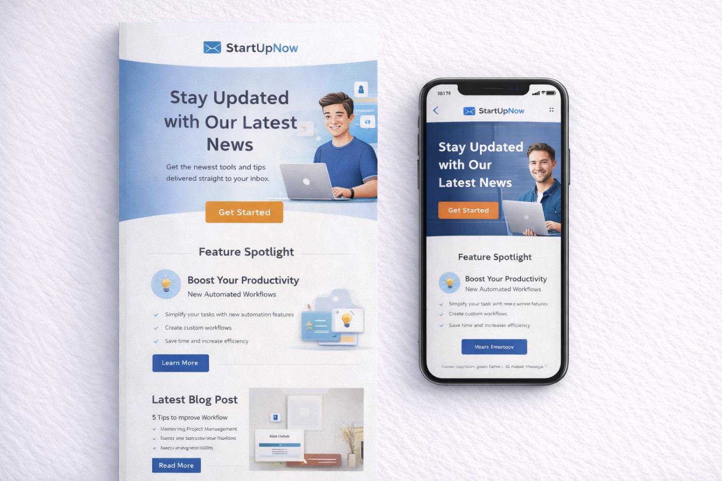
OVERVIEW
A SaaS startup needed a promotional email newsletter capable of announcing a major campaign with immediate visual force. The brief called for an inbox-ready piece that felt current, energetic, and unmistakably tech-forward, while still guiding the reader toward a single clear action. The result is a hero-led layout built to perform equally well on desktop and mobile.
THE CHALLENGE
Startup inboxes are noisy, and a promotional email lives or dies in the first half-second of a scroll. The brand needed to capture attention instantly, communicate campaign details without friction, and encourage click-through, all while remaining legible and composed on small screens. Balancing that visual intensity against genuine readability was the central tension to resolve.
RESEARCH & STRATEGY
The approach drew on patterns common to high-performing SaaS campaigns: strong above-the-fold messaging, high-contrast call-to-action buttons, and clearly separated information blocks. From there the direction leaned into an electric gradient palette and oversized headline type to generate energy, anchored by a centralized CTA module and simplified secondary content so the eye always knows where to land next.
ART DIRECTION
The visual language pairs a neon gradient backdrop with dynamic lighting effects and bold geometric shapes, offset by high-contrast white typography that stays crisp against the color field. Every decision, from button placement to spacing, was made to keep a clear reading flow and mobile-first adaptability without diluting the campaign's visual punch.
EXECUTION
The final build includes a hero announcement section, a dedicated date and time module, a prominent call-to-action button, a secondary promotional block, and a fully responsive mobile layout. Each component was tuned for inbox rendering and scaled cleanly across device sizes, keeping the promotional hierarchy intact from first glance to final click.
OUTCOME
The finished newsletter gives the SaaS startup a visually confident asset built for engagement, positioning the brand as bold and modern while keeping its promotional message easy to scan and act on across every device.