013UI · COURSE LANDING PAGE
Learn to Code – Conversion-Focused Course Landing Page
A responsive landing page built to convert visitors into enrolled students for an online coding course.
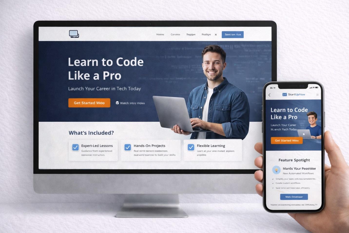
OVERVIEW
This project involved designing a high-performance landing page for an online coding course platform, with the objective of communicating course value clearly while guiding visitors toward enrollment through deliberate visual hierarchy and call-to-action structure.
THE CHALLENGE
The page needed to establish credibility quickly, communicate course benefits without overwhelming the visitor, and encourage signups through well-placed calls to action, all while remaining fully responsive and appealing to an audience of aspiring tech professionals. The central challenge was balancing simplicity with a genuinely persuasive structure.
RESEARCH & STRATEGY
High-converting landing pages typically lead with a clear value proposition above the fold, strong CTA contrast, and trust-building feature highlights delivered in clean, segmented sections. The strategy applied here used a deep blue background to signal trust and professionalism, orange buttons for CTA contrast, and icon-based benefit modules to keep content scannable.
ART DIRECTION
The visual identity pairs a tech-inspired blue field with high-contrast orange call-to-action buttons, clean sans-serif typography, and a spacious, card-based approach to presenting features. UX decisions reinforced the art direction throughout: clear above-the-fold messaging, a dual CTA offering both a start and a watch-intro path, and a benefit-driven layout designed for minimal friction.
EXECUTION
The page was structured around a hero section carrying the headline and CTA, followed by benefits breakdown modules, a feature spotlight section, and a fully responsive mobile layout, all documented in a developer-ready UI structure for smooth handoff. Spacing and hierarchy were tuned deliberately to keep the user's path to enrollment as short as possible.
OUTCOME
The finished design strengthens the course's digital positioning, giving it a page that communicates value clearly and moves visitors toward enrollment with a minimum of friction.