002SOCIAL · E-COMMERCE BANNER SYSTEM
Spring Collection – E-Commerce Banner Campaign
A seasonal banner system that lets a fashion sale feel like a considered launch rather than a markdown.
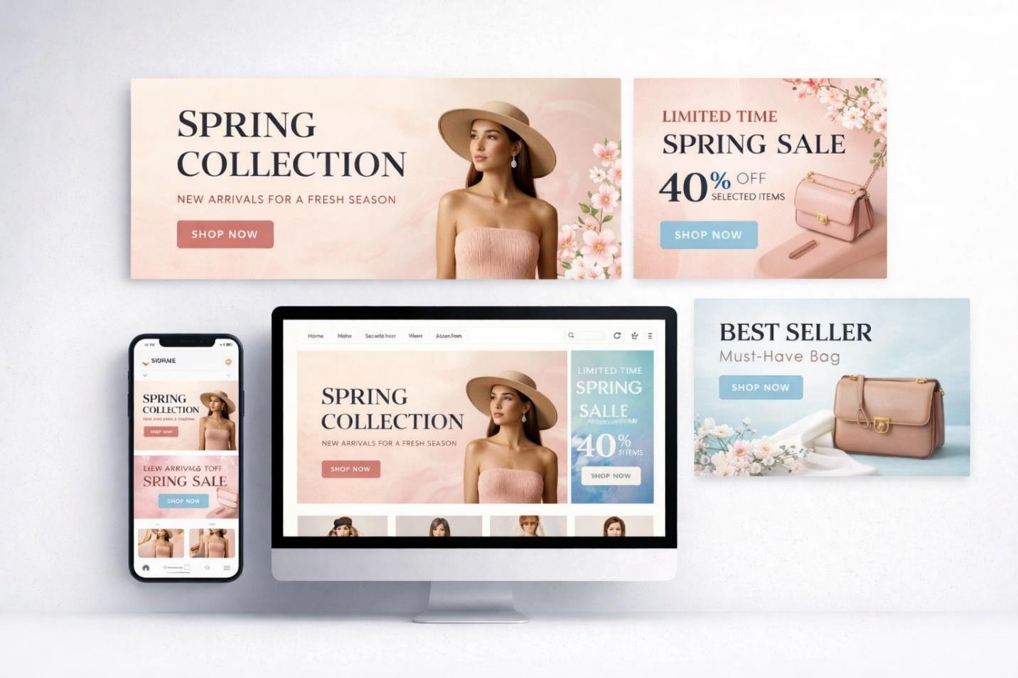
OVERVIEW
This project developed a seasonal banner system for a contemporary fashion e-commerce brand, built to launch a Spring Collection while promoting a limited-time sale. The brief asked for something that felt refined rather than discount-driven, a campaign that could sit comfortably at the top of a homepage without undercutting the brand's premium positioning.
THE CHALLENGE
The brand needed to announce new arrivals, promote a meaningful limited-time discount, and highlight best-selling accessories, all while preserving an elegant tone and a sense of urgency at once. Every banner also had to hold up across devices, from a wide desktop hero to a compact mobile crop, without losing hierarchy or warmth. The core challenge was making promotional messaging feel like part of the brand's voice rather than an interruption of it.
RESEARCH & STRATEGY
Research into high-performing fashion e-commerce platforms pointed toward minimal typography, soft pastel palettes, and generous white space as signals of perceived luxury. The strategy built on that insight with a blush and muted pastel palette to evoke spring freshness, serif typography for sophistication, and modular banner components designed to scale cleanly across placements and devices.
ART DIRECTION
The visual direction favors soft gradient backgrounds and product-focused compositions, letting the merchandise carry the visual weight rather than heavy graphic treatment. Elegant serif type and subtle floral accents introduce a seasonal narrative without tipping into decoration, and call-to-action buttons are placed with clear hierarchy so the eye always knows where to land next. The overall aesthetic reads as calm luxury with promotional clarity underneath it.
EXECUTION
A master homepage banner was built first to establish the visual foundation, then expanded into a sale announcement banner, a best-seller highlight section, and fully responsive desktop and mobile layouts. Every asset was checked against the others for continuity of color, spacing, and type so the series would read as one campaign wherever it appeared, from the homepage to paid placements.
OUTCOME
The completed banner series positions the brand as refined and contemporary while still communicating promotional urgency clearly. It gives the retailer a unified visual identity across the site that supports both browsing and conversion without compromising the brand's premium feel.